PROCUREMENT EXPRESS
Procurement.
Made mobile.
Company spending, purchase orders and invoice decisions. A mobile interface that keeps the context beside the action, with tablet layouts and a dark theme.
Explore the app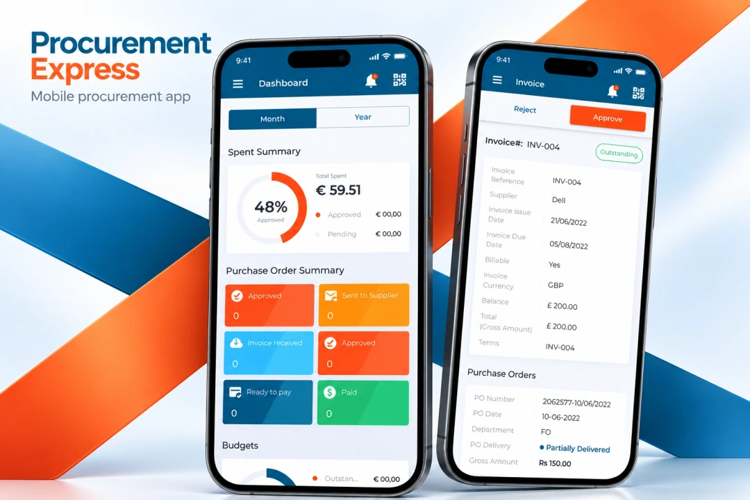
- The product
- Company purchasing
Orders, invoices & document capture - Our scope
- Mobile app UX/UI
Tablet layouts & dark theme - Project contact
- Tung Chan
EXPLORE THE DESIGN
From spending to the next decision.
Explore the mobile dashboard, order and invoice review, document capture, dark theme and tablet layouts.
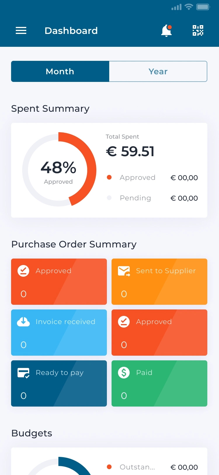
Mobile dashboard — monthly spend, approval chart and purchase-order states
Choose a preview or use the arrows. Open a screen for the complete layout.
01PROCUREMENT APP UX/UI
Put the decision beside the purchasing context.
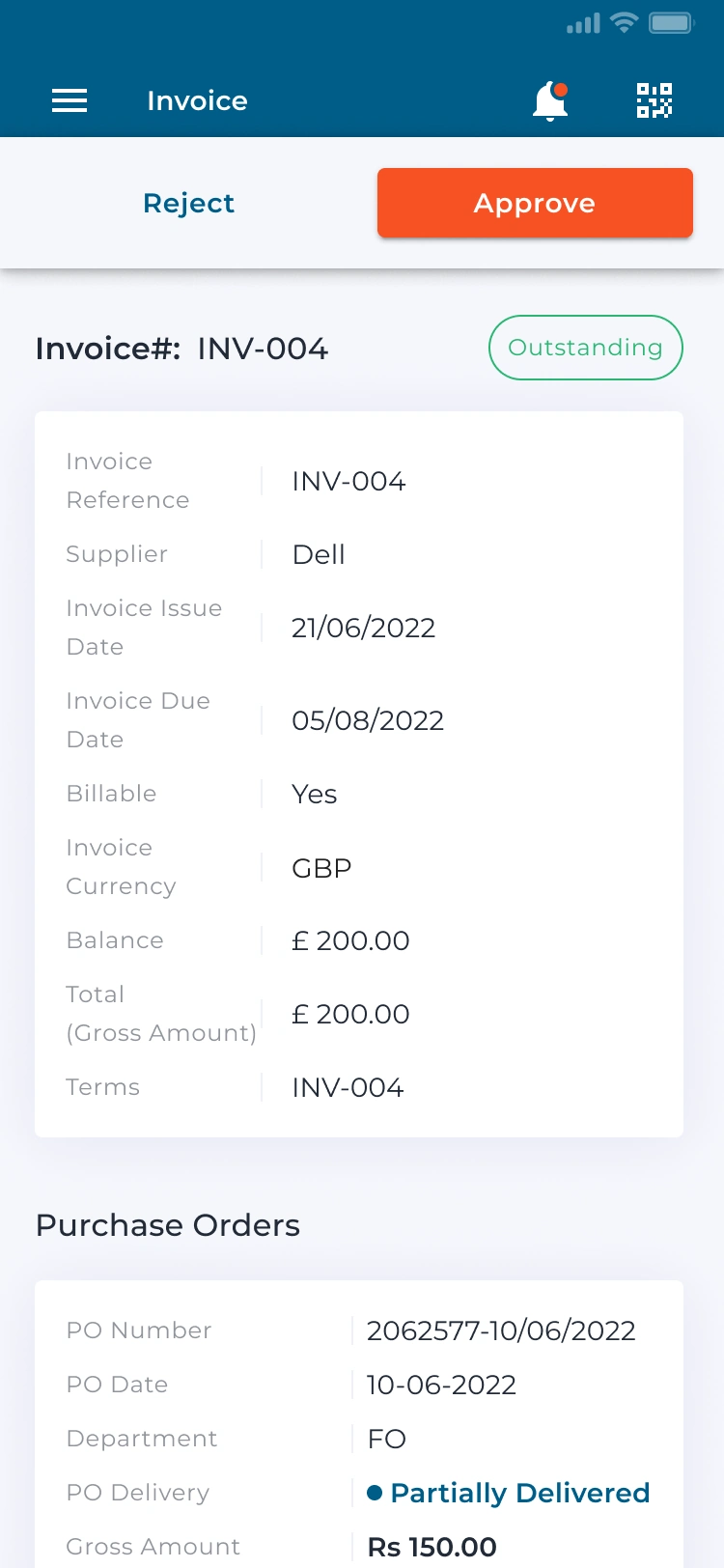
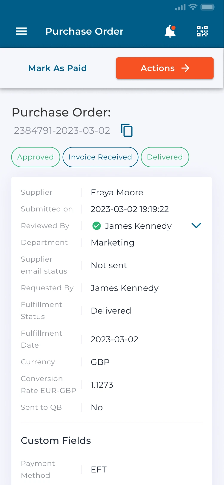
A procurement app needs more than a list of amounts. We designed order and invoice interfaces that group supplier details, status and the review action. The purchase-order view distinguishes approval, invoice receipt and delivery rather than collapsing them into one generic state.
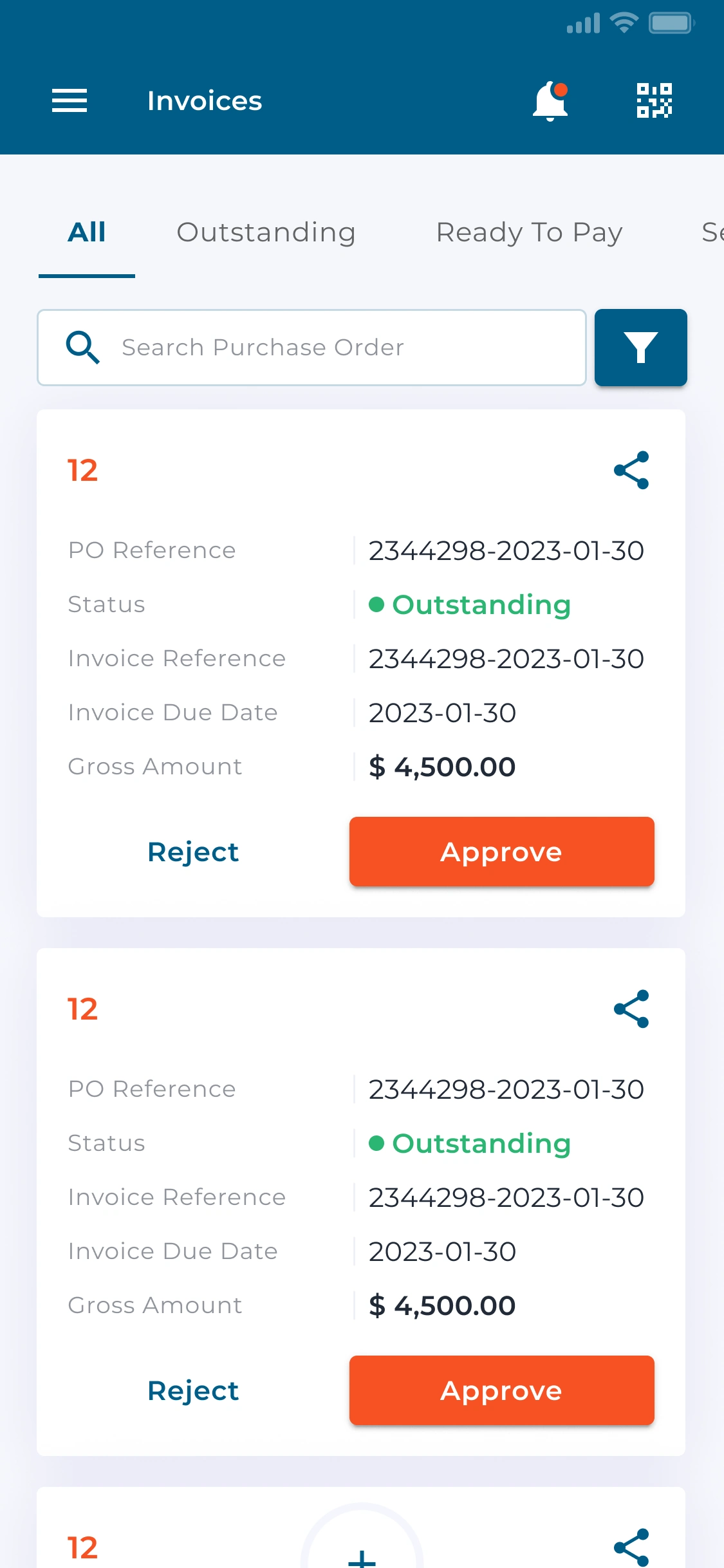
Invoice records use status tabs and search to narrow the list. Each card keeps its reference, amount and approval actions together; the detail view adds supplier and payment context. Orange primary actions remain visually distinct from the surrounding blue navigation.
02TABLET & DARK-THEME DESIGN
The same purchasing system, in a different context.
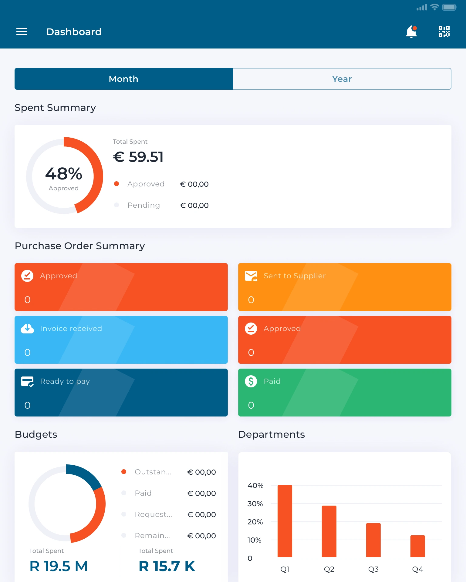
The mobile dashboard starts with spending and a summary of purchase-order states. On a tablet, the wider canvas accommodates budget summaries and department charts alongside the main overview, with shared navigation and a consistent card hierarchy.
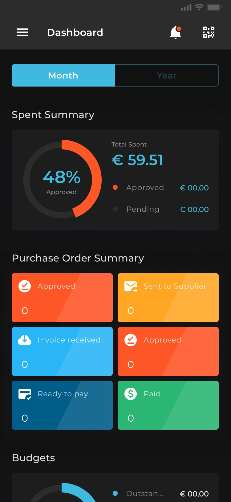
The dark theme preserves those same relationships rather than introducing a different product. Blue navigation, an orange approval chart and colour-coded order states carry across both themes. Our UX/UI scope covers the mobile workflows and their tablet adaptations.
MOBILE APPS & BUSINESS TOOLS
Complex workflows.
Clear interfaces.
Planning a business app or improving a purchasing workflow? Tell us who uses it and which decisions matter. We’ll suggest a scope and estimate.
Get a project estimateExplore the design in Figma