A CLEARER PRODUCT EXPERIENCE
Hello
Aminos.
Product-led.
Information-first.
E-commerce website design connecting a visual product collection, focused product details and an editorial resource section.
Explore the design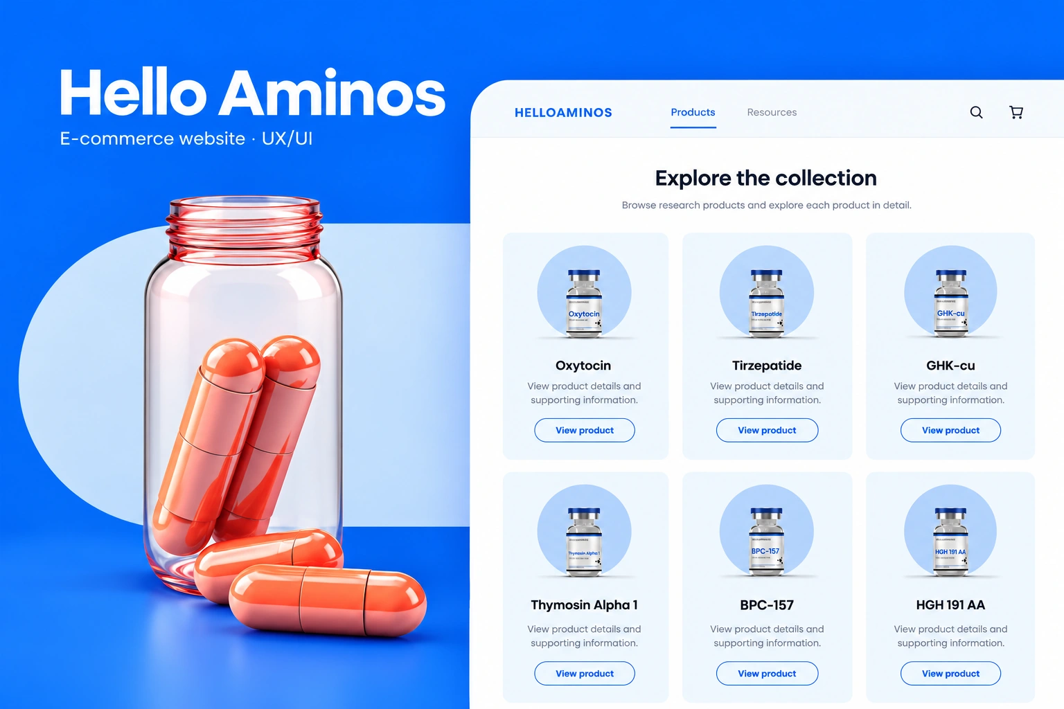
- Our scope
- E-commerce website UX/UI
Desktop & mobile layouts - The experience
- Collection discovery · product details
Editorial content · responsive hierarchy - Project contact
- Olga Bezkrovna
01 / E-COMMERCE WEBSITE DESIGN
A collection with
room to breathe.
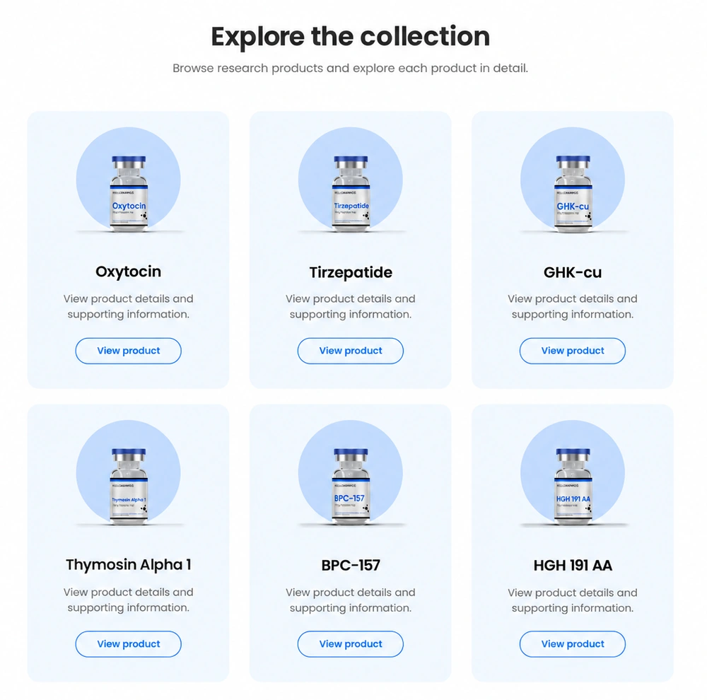
The visual system pairs saturated blue with pale surfaces, rounded cards and Poppins typography. Consistent image areas give each product the same prominence, while a short description and an outlined action create a clear route to the detail view.
The homepage uses a larger, more expressive product illustration. The collection changes pace: a repeatable card system makes the range easier to scan without turning every item into a separate visual treatment.
02 / PRODUCT & EDITORIAL UX/UI
The product.
Then the details.
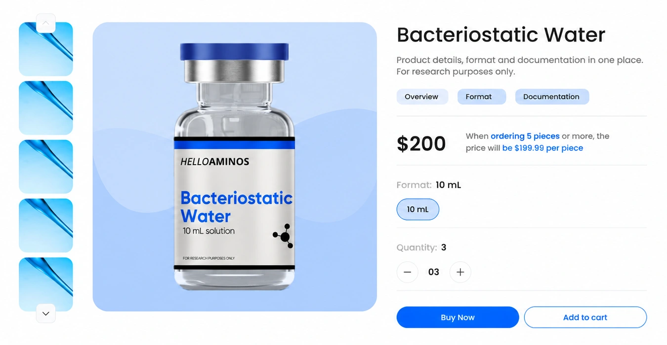
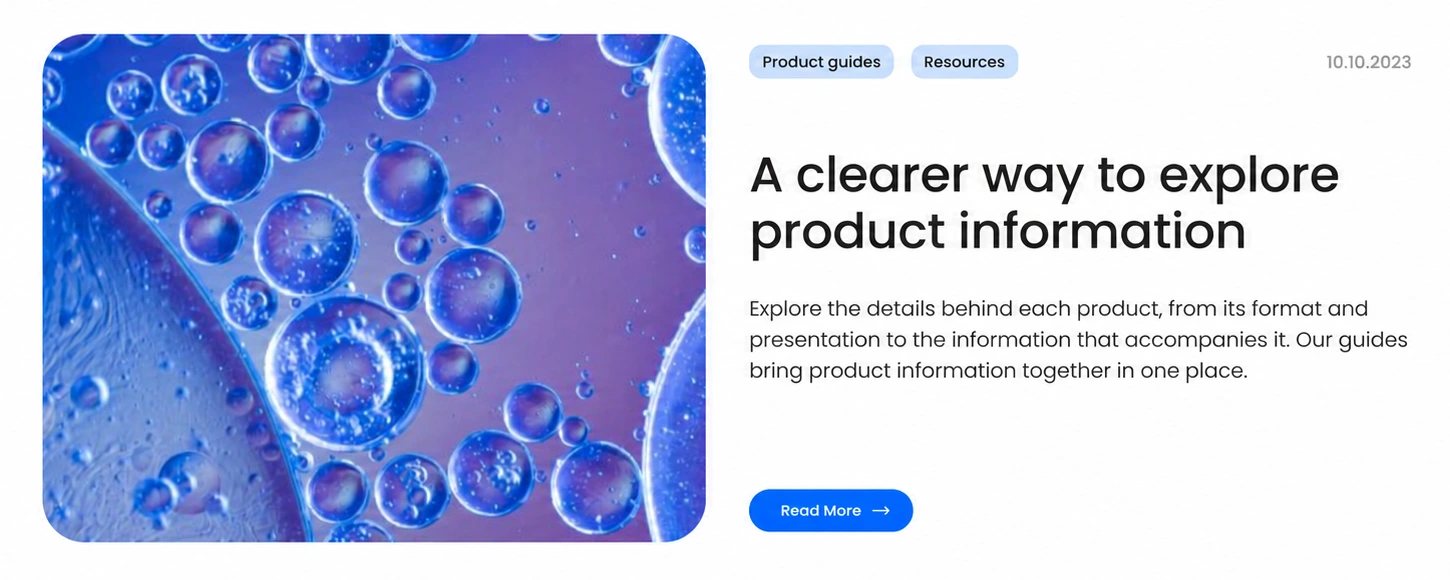
The product page groups photography, format, quantity and purchase controls. The resource section introduces a different reading mode: macro imagery, topic labels and a clear article hierarchy. Shared spacing, colour and rounded geometry connect the two.
EXPLORE THE DESIGN
From first impression to product detail.
Five focused views of the website opening, collection, product detail, resource content and mobile typography. Open a view for a closer look.
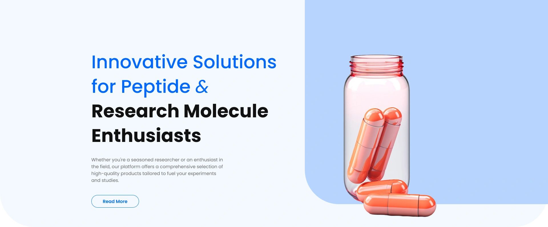
Homepage — expressive typography, glass imagery and a clear first action
Choose a preview or use the arrows. Open a screen for the complete layout.
Presentation note: copy in the collection, product and resource views has been refined for this case study. The design file is unchanged.
BRAND & E-COMMERCE WEBSITES
A distinctive shop.
A clearer journey.
Planning a product website or an online shop? Tell us about the range, the audience and the decisions people need to make. We’ll suggest a scope and estimate.
Get a project estimateView the design in Figma