PRODUCT-LED. ROUTINE-READY.
Bret’s.E-commerce &
subscription design.
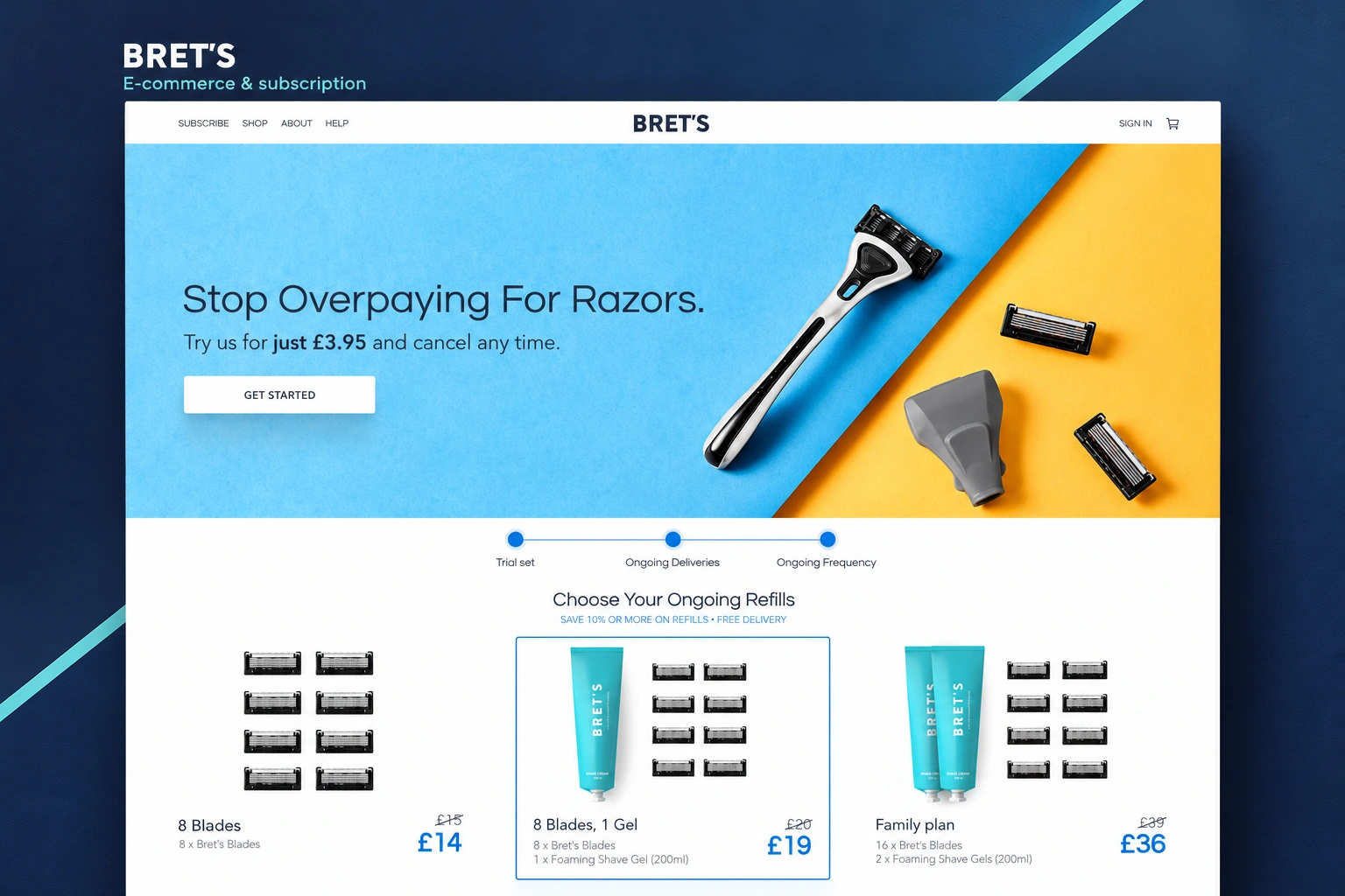
A grooming website that moves from a strong product introduction to a practical choice: what comes in the set, which refills to choose and what arrives next.
- Our scope
- E-commerce & subscription UX/UI
Desktop & mobile layouts - The experience
- Product discovery · plan information
Refill bundles · trial-set selection - Project contact
- Olga Bezkrovna
01 / E-COMMERCE WEBSITE UX/UI
The product leads.
The interface follows.
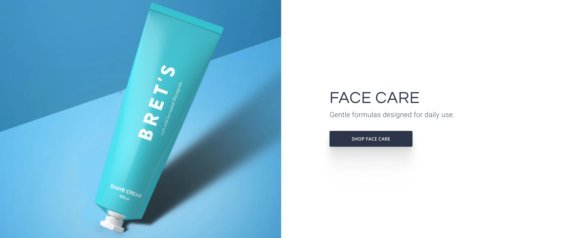
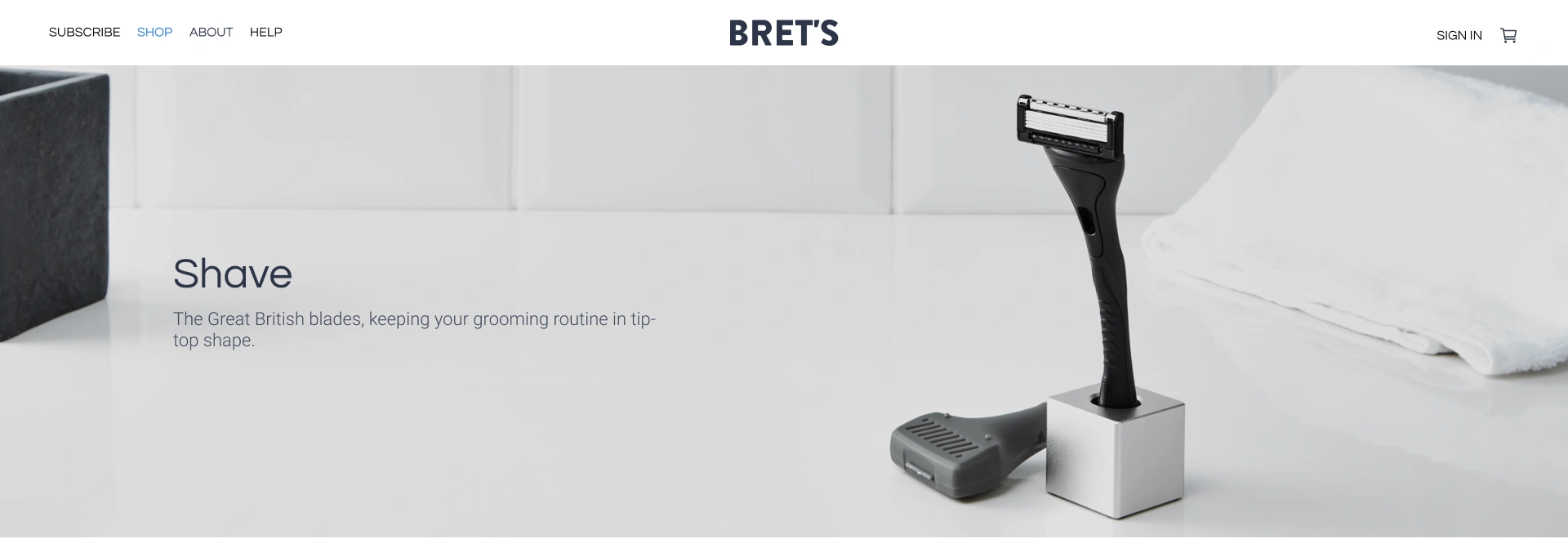
Large product photography gives each category a distinct introduction. The shave page uses a restrained bathroom setting; face care brings in a brighter turquoise composition. Both keep the same short message and focused action.
The website pairs navy typography with light surfaces and blue highlights. That quieter interface gives the photography room without losing a clear route from the brand introduction into shopping.
02 / SUBSCRIPTION-FLOW DESIGN
Explain the plan.
Make the choice clear.
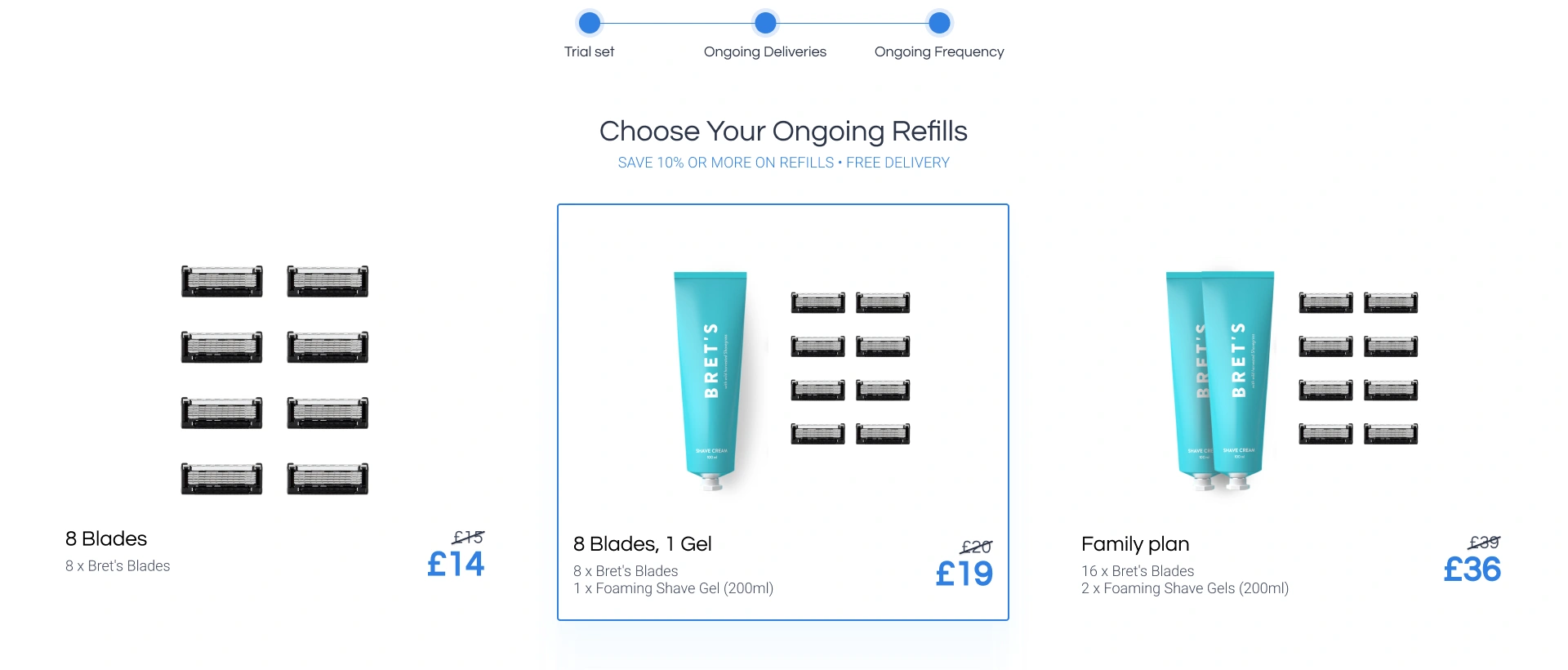
The subscription journey separates the starter set from ongoing refills. Bundle cards make contents, quantities and prices comparable, while a blue outline identifies the active choice. A dedicated explanation connects that selection to future deliveries.
From the first set
to the next delivery.
The plan introduction uses the complete kit as its visual anchor. Supporting content explains the trial, refill planning and cancellation before the visitor enters the selection flow. On mobile, product details and colour choices become a readable vertical sequence.
See the desktop & mobile views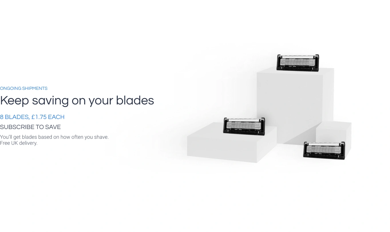
EXPLORE THE DESIGN
The brand, the plan and the product choice.
Nine distinct views across the homepage, product categories, subscription introduction, refill selection, plan explanation and mobile layouts. Open any view to inspect the details.
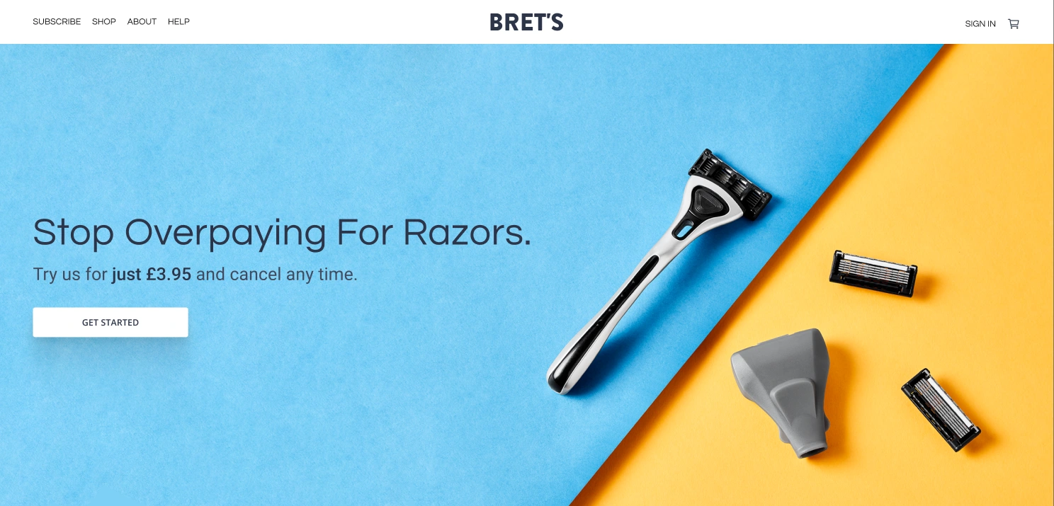
Homepage — a clear first action within blue-and-yellow product photography
Choose a preview or use the arrows. Open a screen for the complete layout.
E-COMMERCE & SUBSCRIPTION WEBSITES
A clear product story.
A considered purchase.
Planning an online shop or subscription experience? Tell us about the range, the audience and the choices they need to make. We’ll suggest a scope and estimate.
Get a project estimateView the design in Figma